Week 10: The Pub
Time: 03/30-04/04, 26.5 hours
Topics: Tech Startups and Entrepreneurship.
Tools: Framer Motion, Netlify, NPM, GitHub, Prismic, Webflow, Gatsby.
Summary:
I racked up more hours than usual this week working on improving my Gatsby/Prismic/Netlify development skills by building a website for The Pub, Wheaton’s independent academic journal. I wanted to see how quickly I could build a new website using the unique workflow I developed working on Wunderite’s marketing site. Here were the steps I took:
- Designed the website in Webflow using placeholder text and images, built page templates, and finalized the “look and feel” of the website, this step included prototyping the animations using Webflow’s intuitive interactions builder.
- Exported the website as static HTML and CSS and set up a blank Gatsby starter website.
- Copied and pasted the necessary HTML and CSS into the Gatsby site, lifted the layout (navigation bar, footer, page template) into a reusable React component, and set up each of the site's pages.
- Set up the CMS objects (staff members, blog posts, issues) in Prismic and linked up the Gatsby site to pull data from the Prismic repository. This step was the most tedious involving troubleshooting GraphQL queries and ensuring the page templates for staff, posts, and issues were working.
- Added animations to the footer, homepage, and menu using Framer Motion.
- Worked on polishing animations and debugging failed builds on Netlify.
After this, the website was pretty much complete but required a cycle of feedback and fixes with the clients. I’m quite proud of the result! Here are the advantages of building a website using this method:
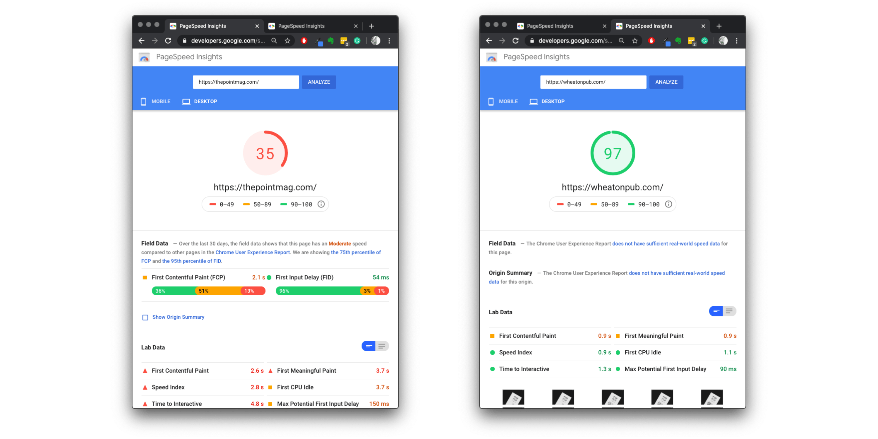
- It’s insanely fast. Compared to websites that don’t take advantage of server-side rendering, a PWA caches stylesheets, images, and data before the page loads, this lowers the wait time for end-users significantly. Check out a comparison between the website for The Point Mag which is a regular website and my website for The Pub (Disclaimer: This comparison may be unfair, as The Pub has less content to load however it does show how much faster PWA’s load. ):

- It’s hosted for free with a 100GB bandwidth cap from Prismic and 300 build minutes per month cap from Netlify. If I had stuck with Webflow’s CMS hosting, The Pub would have to pay at least $12 a month to update content on their site.
- It’s easy to hand off Prismic’s CMS to clients for final use. Prismic’s content editor is intuitive and requires no prior experience to use! I taught Ellie, The Pub’s Editor in Chief, how to publish content on Prismic in less than 5 minutes.
Overall this project gave me much more confidence working with React and GraphQL. I had never written custom animations in javascript before and the Framer Motion library made it a breeze. Check out this website here!
Tech Startups and Entrepreneurship: If I hadn’t joined Wunderite this semester I wouldn’t have learned how to build progressive web apps. Wunderite uses cutting edge tech, as startups nowadays should, to stay ahead of the competition. I think this workflow allows the websites I make to be fast, intuitive, and easy to push content to. I believe web design is one of the most important aspects of entrepreneurship in the 21st century. Standing out from an ocean of competition often comes down to your online identity. Does your website stand out from the millions of websites built from standard templates? Does it respond quickly? Is your website's content fresh and unique?
I favor brutalism, minimalism, typography-heavy, and subversive web design. I want the websites I design to surprise their viewers and push the limits of what a website can represent. From my experience growing up with the internet, 90% of websites follow the same basic layout. They become mundane, you get what you expect to see, the lack of beauty and thought in most websites saddens me. When building your website for the first time or refreshing it, there is so much opportunity to make something truly special!
When I stumble upon a site where it is evident its creators are making an effort to stand out from the bland mass of internet URLs, and if this is done well, I get excited and all the content on their site immediately becomes more essential, more important, and worth my time exploring. I believe this is a subconscious experience for most web lurkers today and that unique web design, and clean, thoughtful branding/styling will make the content of your site truly stand out.
TIMELINE.
These timeline posts were written mostly in hindsight and generated from my journal entries, a detailed timesheet, and any relevant screenshots/media I had saved that week.
← Scroll Left